White cabinets are the most common choice in a kitchen. It’s because white cabinetry exudes a luxurious, bright, and refined look.
- Italian Volcanic Basalt Floor Tile in Gray with White Cabinets to Create a Transitional Look
- Travertine Floor Tile with Hardwood Lining to Contrast and Complement the White Cabinets
- Antique Limestone Floor Tile Combined with White Cabinets to Maintain a Traditional Look
- Create a Dramatic Contrast by Pairing Natural Black Slate Stone Floor Tile and White Cabinets
- Porcelain Floor Tile in Light Gray to Create a Luxurious Look in a Transitional Kitchen with White Cabinets
- Vinyl Tile Flooring in Beige Color to Accentuate the White Cabinets
- Add Pattern in a Cement Floor Tile to Match the White Cabinets
- Marmoleum Click Linoleum Floor Tile in a Checkerboard Pattern to Create a Retro Look with White Cabinets
- Ceramic Floor Tile in Dark Brown Color with Yellow Accent Combined with White Cabinets to Maintain an Eclectic Look
- Walnut Travertine Floor Tile in Versailles Pattern Paired with White Cabinets to Embrace a Conventional Look
- Use Vinyl Composite Tile Floor in Green and White Color to Accentuate the Cabinets
- Reclaimed Terracotta Floor Tile Trimmed by Hickory with White Cabinets to Enhance a French Country Look
- VCT Floor Tile from Mannington in Several Neutral Shades to Complete the White Cabinets
- Blue and White Porcelain Floor Tile in a Diamond Pattern to Create a Calming Look Against the White Cabinets
- Saltillo Floor Tile in Terracotta Color Combined with White Cabinets to Enhance Tuscan Style
- Best Floor Tile Colors for White Cabinets
If you’re planning to change your cabinets in white color, you have to make sure that they will go well with the floor tile.
Why? Because to create cohesion, all the elements in your room, a kitchen, in this case, must work together in some way. It includes the kitchen cabinets and the floor tile.
These two things sit directly next to one another. Plus, they also take up most of the space in the kitchen.
That’s why making sure these two elements coordinate will ensure that your kitchen design is an overall success.
There are several things that you should consider to choose the right floor tile for your white cabinets, from the color, the style, the size, the material, and the accent and pattern.
Basically, the floor tile needs to balance the colors in the entire kitchen. For instance, white kitchen cabinets with dark countertops would be best to be paired with a dark floor to create balance.
If you prefer to have a kitchen with multiple shades of one tone or color, choose floor tiles that have the darkest color in the kitchen cabinets. It can be the darkest tone in wood grain or the glaze color.
Still can’t imagine how to match your floor tile with white cabinets? These are 15 ideas that will help you find the right look for your kitchen.
1. Italian Volcanic Basalt Floor Tile in Gray with White Cabinets to Create a Transitional Look
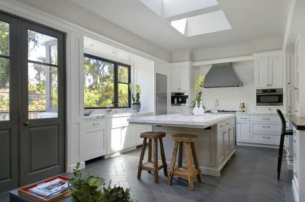
Dark gray floor tile will create a contrast to the white cabinets, but not as dramatic as the black one.
This is an excellent alternative if you don’t like the boldness of black.
This gray tile is actually Italian Volcanic Basalt Floor tile, a kind of tile that delivers a luxurious look in your kitchen because it’s not a common option for the kitchen floor.
The combination of gray floor tile and white cabinets offers an airy look. Plus, they also make the kitchen look more elegant.
The floor tile is set in a herringbone pattern, a pattern that offers a more modern look. If you’re wondering, this volcanic basalt actually came in 16×16, but it was cut to 4×16 to fit the kitchen.
In order to create a well-balanced look, add some other accent colors or shades.
This kitchen has a darker shade of gray for the door, a black window and stool, and two wooden stools in the island area. All of them are a splash of accent element in this gray-white kitchen, things you need to spice up the kitchen a bit.
2. Travertine Floor Tile with Hardwood Lining to Contrast and Complement the White Cabinets
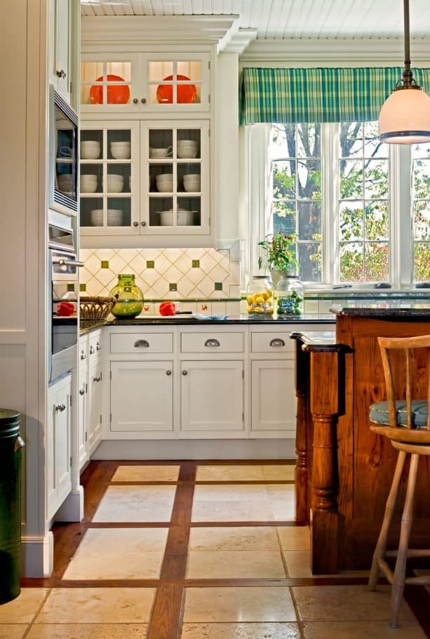
What a unique floor tile combination we have here.
This is actually a travertine floor tile inserted in a hardwood. The antique chestnut hardwood lining is 18” square, and it surrounds the travertine tiles perfectly. The result is the floor with an excellent combination of brown shades, light and dark.
And it turns out that light and dark shades of brown definitely work well with white cabinets. They deliver a timeless look for this traditional kitchen.
Basically, white and brown complement each other because they both are neutral colors.
If you want to achieve a traditional look, always rely on brown for it represents wood, a natural element that’s often used in many conventional designs.
You may wonder how the wood and the travertine tile were joined.
Well, basically, the wood will contract and expand naturally with the humidity, and it changes at different temperatures.
The trick is you should not grout where the tile meets the wood. Instead, use caulk. Naturally, travertine tile will shine, while wood is matte.
To create a similar look to these elements, make sure you finish the tile in hones. The honed finish will take the shine off the tile and make it match the hardwood lining.
3. Antique Limestone Floor Tile Combined with White Cabinets to Maintain a Traditional Look
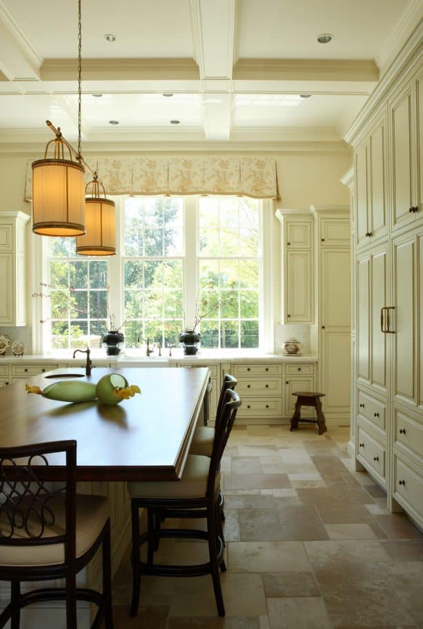
If you want to design a kitchen that has a look of vintage European style, it’s recommended to use stone tile for your floor. Combine it with white cabinets, white walls, white countertops, white windows, and even a white ceiling.
To add a pop of color, place a dark wood dining table in the center as an alternative to the island. This will deliver the kind of vintage countryside look you need.
The floor in this kitchen is antique limestone floor tile in Dijon color, purchased from Paris Ceramics.
The tiles were put in a Versailles pattern. Versailles is also known as a French pattern, which is a classic design that combines two 16×16, one 8×16, two 8c8, and one 16×24 to make an 8 square foot area.
Look how this gray stone tile contrasts the white cabinets. However, the contrast is not prominent.
The stone tile, along with the wooden dining table, represents the traditional look, while white cabinets and other white elements in this kitchen deliver a more timeless look, a versatile design that can fit any style.
But that’s what you need if you have a stone tile floor and dark wood dining table, because they will make the kitchen look dark. White cabinets will tone down the darkness.
4. Create a Dramatic Contrast by Pairing Natural Black Slate Stone Floor Tile and White Cabinets
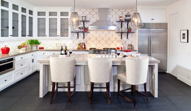
Creating a dramatic contrast is a common option for a modern kitchen. This modern kitchen also has it.
The natural black slate stone floor tile looks in contrast to the crisp white cabinets. They both represent the dark and light shade.
Actually, black and white is a timeless combo that can elevate any room design. However, make sure you use the black wisely unless you make the room too dark.
See how the designer in this kitchen incorporated black.
Since floor tile is the largest element in the kitchen that takes up most of the space, it’s enough to use black for the floor. The rest of the kitchen is mostly in white to counteract the black floor tile.
If you also plan to incorporate black and white in your kitchen, add a splash of color or a pattern to spice up the look.
For some, a monochromatic look may be too boring. To avoid being too plain, incorporate some fun patterns or a pop of bold color. It seems that the designer of this kitchen opted for a pattern.
See how the multicolored backsplash ties the black and white element together.
5. Porcelain Floor Tile in Light Gray to Create a Luxurious Look in a Transitional Kitchen with White Cabinets
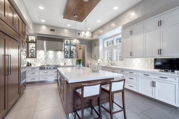
For a transitional kitchen with a luxurious look, you can pair white cabinets with porcelain floor tile.
It’s true that porcelain tile may look too basic. However, if you can lay them in the right pattern and choose the right shade, you can turn the ordinary into the extraordinary.
The porcelain tile in this kitchen comes in light gray color.
Along with the wooden island and cabinets, it delivers a traditional look to the kitchen. Its simplicity and minimalist style make it the right element to create a conventional style.
On the other hand, the white cabinets, white countertops, and white patterned backsplash exude a more modern look.
The designer managed to beautifully combine the modern and traditional elements in this kitchen. Hence, the transitional look.
There are two types of cabinets, wood and white ones. They contrast each other, but the simple light gray porcelain tile somehow ties them together.
This is the kind of floor tile you should choose if you want to keep the background simple, an element that doesn’t demand much attention but is basically important to complement every other element in the kitchen.
6. Vinyl Tile Flooring in Beige Color to Accentuate the White Cabinets
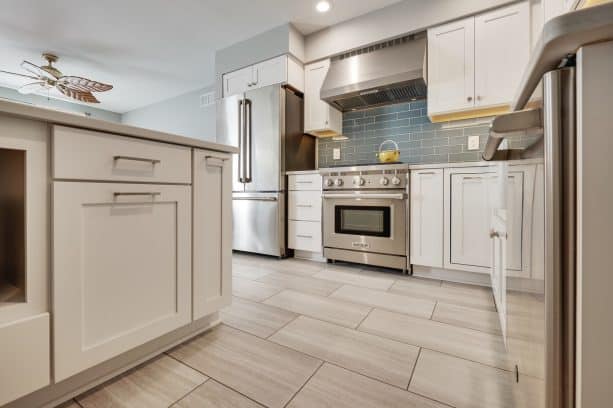
If you think that vinyl tile is not suitable for the kitchen floor due to its characteristics, think again. This floor tile has a beige color that accentuates the white cabinets nicely.
After all, beige is only one or two shades darker than white, so if they are combined, they will deliver a bright and airy look, but not too stark and intimidating.
This vinyl tile is the luxurious type. It comes with a waterproof seal and ant-microbial coating on top, so you don’t have to worry about dirt and stains.
Even though this vinyl tile is in a light color, damage and stains won’t be visible. It’s a problem that makes most people hesitate to use white or light-colored floor tile. But with the right coating, you’re free to use any light-colored floor tile.
In order to avoid being too plain with the all-white design, instead of pattern, the designer opted for a splash of color instead.
The blue-colored glass tile backsplash is enough to make the white cabinets and beige floor tile look less boring.
Adding an accent color will instantly make your kitchen look more modern. It’s an excellent idea to apply in a monochrome kitchen that looks too crisp.
7. Add Pattern in a Cement Floor Tile to Match the White Cabinets
Why settle for a boring colored floor tile if you can have fun with it?
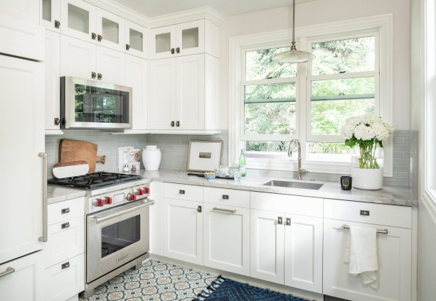
This enclosed kitchen features a multicolored floor in a vintage pattern. This is a cement floor tile with blue and white color.
It’s true that you should add a pop of color in an all-white design to make it less intimidating. But, you don’t have to add the color in other elements if you can incorporate it right on the floor, the thing that sits rights next to the white cabinets.
Adding a splash of color on the floor will make it look attractive and prominent. This way, the canvas is not the floor tile anymore, but the white cabinets. The stark white cabinetry works as a backdrop for this patterned cement floor tile.
In order to add more fun elements, the designer also placed a blue rug on this patterned floor.
The blue rug complements the blue and white floor tile and, at the same time, ties the floor tile and the white cabinets together.
It’s recommended to add a rug that matches the patterned floor in a transitional kitchen, because both deliver a modern look that the white shaker cabinets can’t give.
8. Marmoleum Click Linoleum Floor Tile in a Checkerboard Pattern to Create a Retro Look with White Cabinets
Who said that traditional kitchens should only use neutral shades? This one proves otherwise.
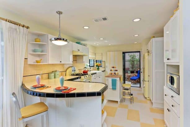
See how butter pink accentuates the white elements in this kitchen. The yellow color is not simply used for decoration, but it’s used on the most surface of the floor, from the floor, the wall, the countertops, and the backsplash.
The designer created a retro design to fit the personal preference of the homeowners. Even though the elements come in vintage style, they are also finished in a bright sunny tone to deliver a cheerful and comforting ambiance.
According to the designer, the homeowner wanted a kitchen that expressed her fun creatively, an unconventional style while delivering all the modern conveniences out of a retro look.
This floor tile is actually linoleum floor tile which is called Marmoleum Click. The colors are Barbados and Natural Corn.
Bright and optimistic yellow definitely sets the tone in this kitchen. Combined with retro-inspired appliances, the butter-yellow is obviously the key element of the design.
The way the designer positioned the floor tile playfully represents a modern and quirky style, but the traditional checkerboard pattern contrasts it all.
The white cabinets serve as a canvas in this kitchen. They are a backdrop for the butter-yellow linoleum floor, but at the same time, the white tile on the floor complements the cabinets.
It’s safe to say that everything in this kitchen is perfectly-balanced.
9. Ceramic Floor Tile in Dark Brown Color with Yellow Accent Combined with White Cabinets to Maintain an Eclectic Look
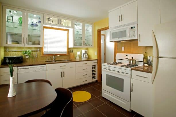
After all the traditional kitchens you’ve seen before, now let’s move on to the eclectic kitchen. The coordination of several colors, patterns, and styles enhances the eclectic style in this kitchen.
The floor is ceramic floor tile made by Refin Ceramiche of Italy in brown color. Dark brown ceramic tile will set the kitchen in a retro style, but combining it with white cabinets offers a more refined look.
See how perfectly balanced the color is in this kitchen. The dark brown floor tile matches the countertops flawlessly. Along with the wooden dining table, they counteract the starkness of the white cabinets.
To top it off, there’s a square-shaped pattern in yellow in the middle of the brown tile. These yellow tiles clash with the brown, but that’s the point you should achieve in an eclectic style.
The gold-colored tile backsplash adds more character to the kitchen, while the yellow walls make everything look fun and bright.
It’s clear that the white cabinets in this kitchen are meant to tie every color, pattern, and style together.
It’s true that in an eclectic style, you’re free to experiment with anything. But of course, you need that one element in a timeless color and style to connect everything.
10. Walnut Travertine Floor Tile in Versailles Pattern Paired with White Cabinets to Embrace a Conventional Look
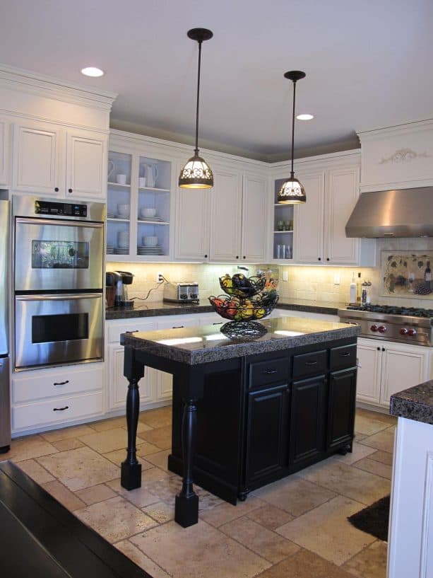
Nothing beats light brown and/or beige floor tile when it comes to conventional design.
When combined with white cabinets, the light brown floor tile will give the right amount of contrast, not too subtle but not too dramatic either.
The floor tile is walnut travertine in a versailles pattern. The pattern makes the entire kitchen look a bit more fun but still in a conventional look.
Actually, even though the light brown floor tile does complement the white cabinets, it looks to clash with the solid black island. Yet, that’s the beautiful and whimsical part of this kitchen.
We can learn that although traditional kitchens usually incorporate neutral shades, you can make them clash just to create a quirky look.
Obviously, the black island is meant to be the focal point of this kitchen, a contrasting element to counter the brightness of white cabinets in the perimeter and the white walls.
On the other hand, the walnut travertine tile in light brown color is meant to be a bridge to connect the black and white combo.
Usually, people use gray to bridge black and white, but brown will offer a more unique look.
11. Use Vinyl Composite Tile Floor in Green and White Color to Accentuate the Cabinets
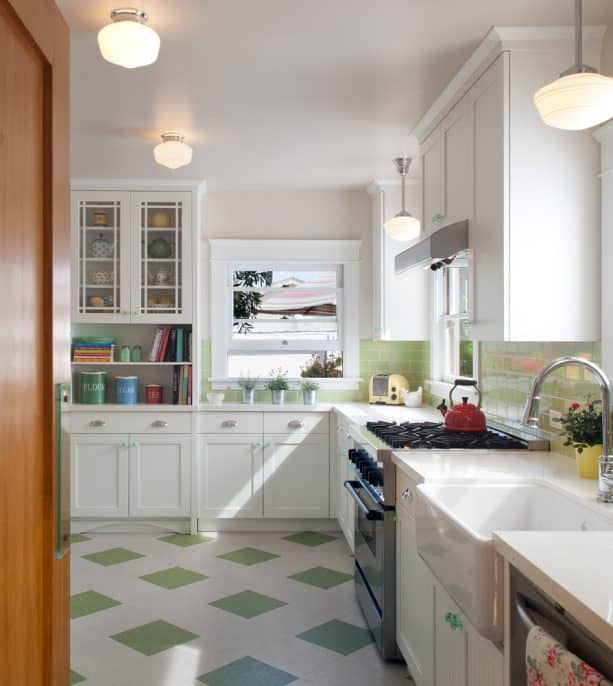
As a neutral shade, white can be paired with any color. White cabinets in this kitchen also act as a background to make other accent colors pop.
After yellow, now it’s time for another bold color. It turns out that green is a flawless accent color that looks pop against the white cabinets and adds a more organic look to the whole kitchen.
As one of the earthy tones, green will never fail to give you a natural appearance because green represents forests, plants, and living things.
When you combine green and white, you’ll get a timeless look that, despite the style, it will create a freshening ambiance.
The floor is vinyl composite tile, a commercial-grade, from Armstrong, which is very cost-effective. The green color is Little Green Apple.
Laid in a diamond pattern, the green and white vinyl composite tile create a flowing look because the eyes will automatically follow the pattern. Thus, it can make the kitchen appears bigger.
In order to make a balanced look, the Little Green Apple color on the floor is matched with the green tile backsplash.
The green on the backsplash is a bit lighter, more like lime green, while the green on the floor tile is softer. But all in all, they complement each other and work together to make this kitchen look brighter.
12. Reclaimed Terracotta Floor Tile Trimmed by Hickory with White Cabinets to Enhance a French Country Look
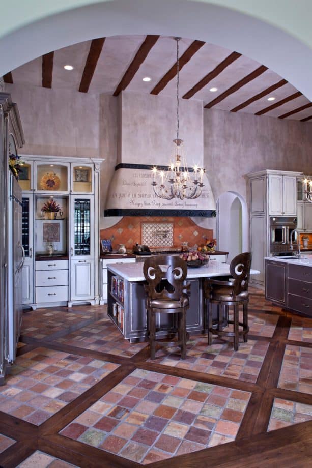
If you have a high ceiling kitchen, incorporating dark brown in it is an excellent idea to enhance the traditional style.
Why does it have to be a high-ceiling kitchen?
Because a low ceiling room, when combined with dark shade elements, will only look crammed and full. Thus, you need a spacious room to incorporate a wooden element to keep the airy feel.
This kitchen has brown-colored floor tile in multiple shades, which is a reclaimed terracotta floor tile purchased in France.
These tiles are inserted into Hickory wood planks to create a unique look. The hickory wood planks are what make this kitchen look dark. They contrast the tiles, which are basically in light shades. These tiles are used to keep the authentic old-world French design.
The finishes were also carefully selected to fit the french style preference of the homeowners.
Unlike the previous pictures where the white cabinets look prominent and bright, the cabinets in this kitchen look a bit dull and don’t spark brightness.
It’s because they are paired with several shades of brown floor tile, beige wall, and dark-colored island.
The brown color elements, especially they are mostly finished in a dark tone, counteract the starkness of white. But it’s a great idea to apply if you don’t really like a crisp and polished look.
13. VCT Floor Tile from Mannington in Several Neutral Shades to Complete the White Cabinets
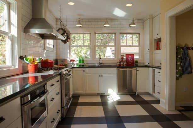
This is another vinyl composite tile on the floor of a traditional kitchen.
Unlike the previous pictures, this floor tile combines several colors together. This is a perfect inspiration for a timeless look.
The multicolored floor can basically fit in any design, especially when paired with white cabinets. The neutral shades on the floor make the cabinets look whiter and more polished.
The VCT flooring in this kitchen is from Mannington, Commercial Solid Point line. The shades are Cameo White, Midnight, and Iron. All of those shades create a simple and traditional pattern but still look stylish at the same time.
The grout is a light gray, a kind of grout that’s not visible because it’s not meant to stand out but to blend with the tiles.
It seems that the homeowners wanted to keep the simplicity and minimalist style in this kitchen because there is no accent color added.
Every element in this kitchen was carefully picked in a neutral tone to complement each other. Too plain for some, but it’s the safest option if you don’t know what to pair with the white cabinets.
14. Blue and White Porcelain Floor Tile in a Diamond Pattern to Create a Calming Look Against the White Cabinets
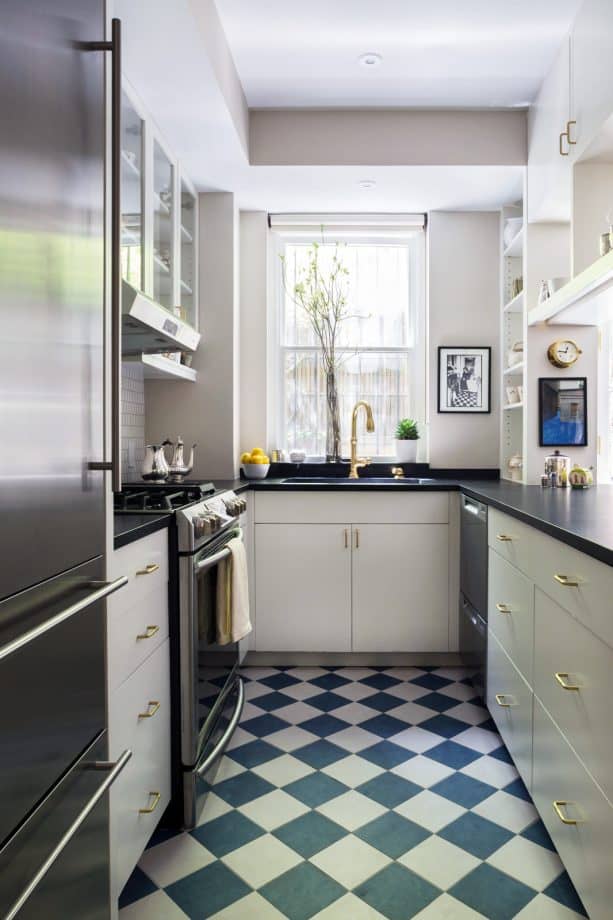
After yellow and green, now here comes the blue.
This is a porcelain tile floor in blue and white color. Similar to green, blue is also an accent color that will bring out the freshening look in your kitchen. To top it off, blue is also a calming and tranquilizing color.
Incorporating blue on the floor is a way better option than on the wall because it’s more cost-effective.
The blue and white porcelain tile is laid in a diamond pattern, a common pattern that’s usually used in a traditional style. It makes the floor look more cohesive and well-coordinated.
Despite the common pattern, blue and white porcelain tile also adds more fun to the white cabinets.
Black appliances and countertops also contrast the whole look.
Since this is a small kitchen, be careful if you incorporate bold and dark colors. Don’t use them too much unless you want to make your kitchen look even smaller and crammed. White elements should dominate the room to brighten it up.
15. Saltillo Floor Tile in Terracotta Color Combined with White Cabinets to Enhance Tuscan Style
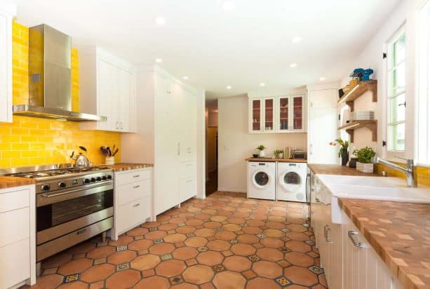
In order to enhance the Tuscan look in this kitchen, the designer installed a Saltillo tile imported right from Mexico.
This is an Octagon Saltillo tile, a 2-tile pattern that uses a 4” insert. The 4” insert is a combination of painted Talavera tiles and Saltillo tiles.
This kind of tile adds more depth and dimension to the kitchen. See how the entire surface of the floor looks a bit more 3-dimensional.
Even though this terracotta Saltillo tile contrasts the white cabinets, it complements the brown countertops.
The white cabinets look brighter and stand out more against this unique patterned tile. It’s the kind of tile you need if you want to incorporate a traditional element but at the same time a unique and whimsical look too.
The bright yellow backsplash is meant to be an accent in this kitchen. Terracotta floor and white cabinets are neutral shades, so when combined, they deliver a perfect traditional style (in this case, Tuscan).
But the designer didn’t stop there. It seems that she wanted to add a splash of fun, a bit of modern vibe to this kitchen. Therefore, the bright glass tile backsplash was added.
Bright yellow and terracotta do clash with each other. Not only the color but also the finish. The glossy backsplash looks odd against the matte floor tile. That’s why they are not juxtaposed directly.
There’s the white cabinetry as a border to separate them both. It means that the white cabinets in this kitchen are not only supposed to be the canvas but also the element that ties two clashing colors together and keeps them in harmony.
16. Best Floor Tile Colors for White Cabinets
Basically, almost every type of tile can work well with white cabinets, from cement tile to VCT.
Now, let’s talk about color. You’ve seen many good colors above. But, what are the simple guides to match white cabinets and the floor tile?
- Dark floors: From espresso to true black, this floor tile color will create a dramatic statement with white cabinets. Dark floor tiles are the perfect option in modern kitchens, especially in a modern kitchen that has a dark accent, like backsplash or countertops.
- Neutral shade floors: If you think dark tiles are too overwhelming for your style, pick a few lighter shades. For instance, slightly dark gray tiles will be the best alternative for black tiles to create a modern look. Beige or brown wood tones are versatile. Just avoid hues that look too orange because they can clash with your white cabinets.
- Light floors: If you want to maintain an airy feel and open look in your kitchen, pair white cabinets with light-colored tiles. You can choose a tile that can mimic a light wood floor. Just make sure that the light tile doesn’t look too yellow. Light tiles should deliver a subtle contrast to the white cabinets, but overall they should complement each other.
- White floors: White tiles are actually not a popular choice to pair with white cabinets, but that doesn’t make it impossible to pair with them. White tiles and white cabinets can be your best bet if you want a rustic feel and look. They will offer a polished and sleek look. It’s best for households without kids or pets because white tiles can show damage and stains more easily than other colors. You can use matte flooring and combine it with brown or gray neutrals elsewhere in the kitchen.
Leave a Reply