Adding an accent wall in your room is basically not a new idea. It’s a common thing to apply in the decorating industry.
The easy and stylish color accents can never be out of style because of their flexibility.
- Red Wallpaper as an Office Accent Wall that Matches the Chair
- Pink Painted an Accent Wall in a Modern Home Office
- Embossed Leather Tiles with Sconces as an Accent Wall in a Contemporary Office
- Wood Panels Home Office Accent Wall to Add a Rustic Touch
- Window Wall Surrounded by Wood Elements as an Accent in an Office Corner
- Using Bulletin Board as an Accent Wall in an Office
- Hanging Artworks to Create a Simple Accent Wall in an Office
- “Pause” Wall Covering in Orange and White to Create a Bright Office Accent Wall
- Dark Red Painted Office Accent Wall with Black and White Framed Pictures
- Abstract Wall Art in Geometric Shapes as an Accent in a Home Office
- Floor to Ceiling Monochrome Framed Artworks as an Office Accent Wall
- Creating an Office Accent Wall out of a Built-in Floor to Ceiling Bookcase
- Peel and Stick Wall Mural as a Vibrant Office Accent Wall
- Gray Painted an Accent Wall in a White Office
- Dark Blue Accent Wall with a Fireplace Surrounded by a Porcelain Tile in a Home Office
- Half Mount Fish Replica in a Soft Green Office Accent Wall
- Built-in Wood Cabinets as an Office Accent Wall
- Combination of Bricks and Wall Covering as an Accent in a Small Office
- Do’s and Don’ts in Choosing Office Accent Walls
Basically, the sky’s the limit when it comes to creating an accent wall. There are unlimited options for the walls, be it the paint, the surface, or the material.
The question is, does a home office really need an accent wall?
Actually, there’s no limitation for an accent wall.
If you have a neutral-colored room, it would be best to add an accent wall. If you want to keep the rest of your home office simple and minimalist, it would be nice if you create a statement through an accent wall.
The office accent wall should also be suitable for the room’s function. In other words, make sure the accent wall you choose won’t distract you from working.
Still looking for the right accent wall to decorate your minimalist home office?
Here are 17+ drop-dead gorgeous office accent walls that will surely liven up your working space:
1. Red Wallpaper as an Office Accent Wall that Matches the Chair
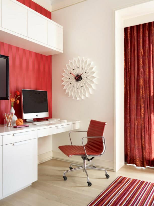
The textured wall accent in this office is basically wallpaper. It is Fusion in Rose by Elitis, the kind of wallpaper you can choose if you’re after a bold and bright color for your home office.
For some, red may be a bit too much. However, if you’re able to match it with the other elements in the room, red will become a full-of-spirit color, a shade that will energize you. Perfect for a home office.
The designer matches the red wallpaper with the chair, which is Eames Aluminum Management Chair in Edelman Leather. It turns out that red also appears on the striped rug and the curtain. Even the decorative clock has red hands!
Don’t worry about using bright colors too much. As long as you have white as a canvas, you’re okay with any element in a similar bright color spread all over the room. It is even recommended, because this way, you’ll achieve a cohesive look that most people look for.
Incorporating bold color as an accent wall, in this case, red, will counteract the starkness of white.
2. Pink Painted an Accent Wall in a Modern Home Office
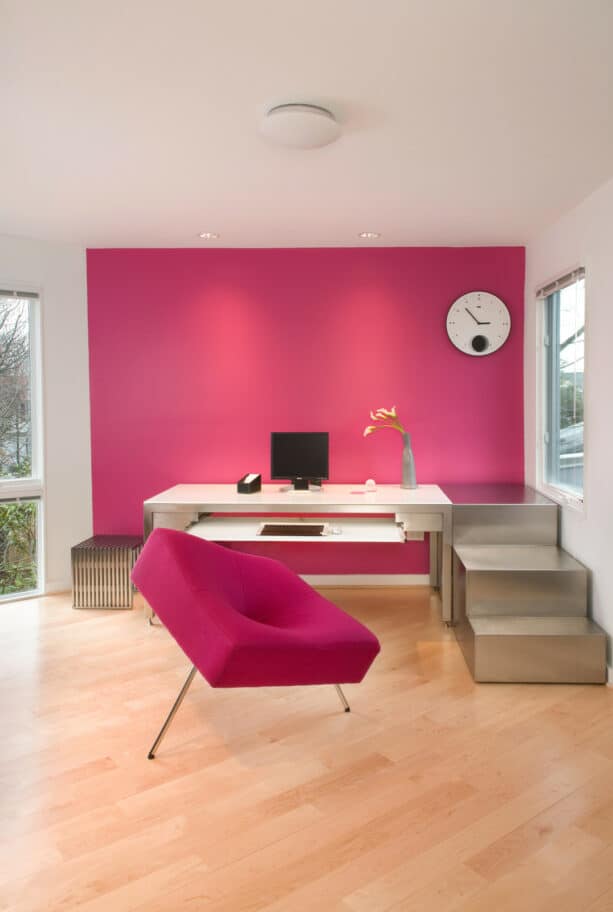
You can paint your accent wall in a bright pink like this to add a feminine touch.
Even though gender basically has no color, we can’t deny that mostly pink is associated with being feminine.
A bright pink accent wall is also meant to be a splash of color in a neutral color palette in this home office.
As simple as it sounds, this accent wall is only painted. There’s no detailed information about the certain paint used, but you can opt for Benjamin Moore – Hot Lips as an alternative.
Painting the wall to create an accent is the best option if you don’t want to deal with the fuss of installing different materials and playing with texture.
Still, the rule has to apply. For one bright color as an accent wall, you need to match it with other elements in the room.
Since this is a minimalist office, so the only thing that matches the pink accent wall is the chair. Both look prominent against the light tone wood floor and white walls.
To give a finishing touch to create a modern look, the designer added the custom-designed metal steps beside the desk. It turns out that the metallic accent and bright pink color complement each other in a modern setting.
3. Embossed Leather Tiles with Sconces as an Accent Wall in a Contemporary Office
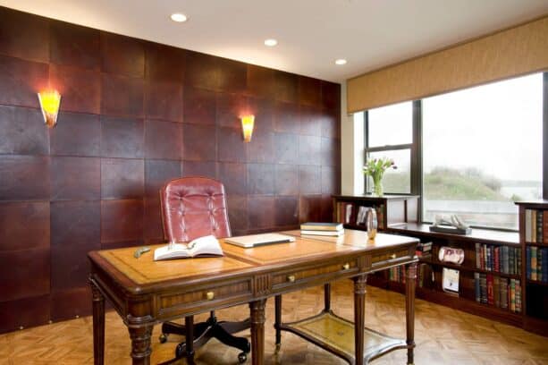
Totally different from the previous picture, this one exudes a masculine look strongly.
Nothing beats the masculine style of dark brown tone and leather. And such a combination will amplify the effect.
This home office has a unique accent wall that’s made of embossed leather tiles in 13” x 13”.
There are two sconces mounted there to accentuate the entire look. The warm yellow glow from the sconces makes the leather tiles look even more elegant and stylish.
If you’re wondering, these tiles are from Ann Sacks. See how rich this home office is. The accent wall matches the custom-built bookcase that fits under the window.
Even though it looks a bit lighter than the accent wall, the leather chair is also made of similar material. And all of them are put against a light brown background: a textured tile floor and the window treatment.
This is surely the best contemporary home office. The leather tiles have upped the ante of masculinity.
However, keep in mind that this accent wall is only suitable in a bright and spacious room. If it’s installed in a small room with minimal light, it only makes the room look even darker and smaller.
So, make sure you have a sufficient amount of light and huge windows to counteract the darkness of brown shades like this.
4. Wood Panels Home Office Accent Wall to Add a Rustic Touch
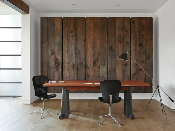
No matter what style you use for your home office, it’s always a great idea to incorporate wood, especially in a dark tone, if you want to add a rustic touch.
This home office basically has a contemporary style, but the wood panels as an accent wall give a touch of a rustic look.
This accent wall is made of reclaimed redwood sourced from a local salvage yard.
See how to stand out the wood panels against the white walls. It proves that you don’t have to use a bright and bold color to paint or cover your wall to create an accent. You can always rely on wood as a timeless element for a more down-to-earth option.
Fun fact: this wood accent wall is actually doors for a large wall-hung cabinet that doubles up as a Murphy bed! How cool is that? What a practical use of an accent wall.
Even though the floor in this home office is also made of wood, it looks pale compared to these wood panels.
If you’re curious, the flooring is a common white oak in a 5” width. It’s stained in a light gray and finished in Matte Bona Naturale.
5. Window Wall Surrounded by Wood Elements as an Accent in an Office Corner
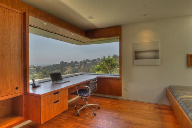
Basically, the home office can be anywhere in your home, including in the master bedroom.
If you lack space, incorporating an office corner in your bedroom would be a great idea, like you see in this picture.
Basically, this is a bedroom, but with a home office area in the corner, this can be a great working space.
Instead of using decorative color or material to accentuate the wall, the designer created a window wall. This is the most functional and aesthetic option out there.
Window walls, especially cornered window walls like this, will never fail to give a statement around a wood element. Combine it with minimalist recessed ceiling lights, and you’ll get a super stylish and ultra-modern accent wall.
Having a window wall as an accent in your home office is great to help you cope with the work pressure. Whenever you get tired, looking out the window will be a release.
This window accent wall is surrounded by a built-in desk and cabinet made of medium tone wood, similar to the floor. The rest of the wall is basically painted in white.
6. Using Bulletin Board as an Accent Wall in an Office
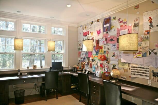
To enhance the fact that the room is a home office, you can create an accent wall out of a bulletin board.
It takes a very huge bulletin board to create an accent wall, but it turns out that this is a great idea. It’s practically simple and no-fuss. You have to use magnetic paint to create an accent too out of a bulletin board.
In order to make it look more colorful and vibrant, don’t just settle with black and white notes.
It would be helpful if you add some multicolored stickers, or if you paint something on the paper with colorful markers, or you can use any paper but white to stick there, and don’t forget to add more bold and bright accessories to be added among the notes.
There is no rule on how to create a bulletin board. You can experiment with what you like, but make sure that you don’t overwhelm the board with too many colors that you turn it into anything but a bulletin board.
Add some hanging pendants in front of it to highlight the entire look. If you need to look for something specific on the bulletin board, this will be a good idea. The light will help you get the right note.
7. Hanging Artworks to Create a Simple Accent Wall in an Office
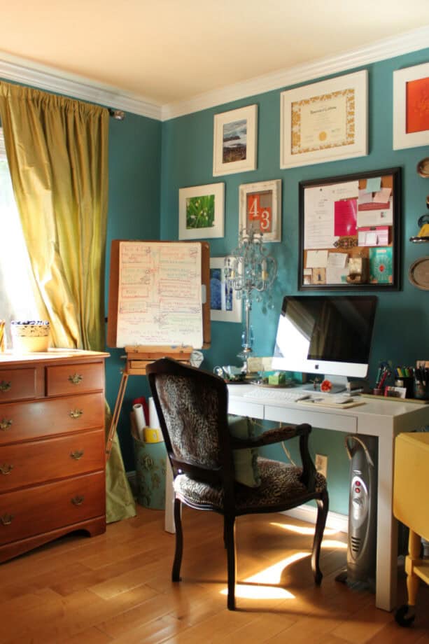
If you’re into an eclectic style, it’s recommended to use something artsy for your accent wall.
In this eclectic home office, the designer hung a series of artworks on the wall to create an accent, one of the simple ways to create an accent wall. Right in the middle of the artwork, there’s a simple and small bulletin board.
For some, this looks maybe a bit too messy. However, if you’re working in a creative field where you need to get inspired regularly, chances are you’re not comfortable working in a super clean and sleek room.
The creative ones are notoriously messy. They like their rooms to be comfortably cluttered. So, this home office is the perfect look for them.
Basically, the wall paint itself has already been bold and made a statement. The green paint is actually Benjamin Moore – Rendezvous Bay. It looks bold combined with the olive curtain, even though they basically share the same color.
But since this is an eclectic office, the designer was free to choose any color and element to add, as long as they complement each other.
Since the accent wall is already bold, when you incorporate artworks, make sure the frame is white to balance the boldness of the background.
8. “Pause” Wall Covering in Orange and White to Create a Bright Office Accent Wall

Orange may be the last color to choose when it comes to decorating because, for some, the brightness and boldness of orange can hurt the eyes. Yet, the designer managed to incorporate orange in this home office.
It’s not purely orange, though. It’s combined with white to tone down the vibrant look of orange, and it delivers a lovely look.
This accent wall is actually a wall covering from Knoll, and this product is called “Pause”.
The designer didn’t entirely cover the whole side of the wall with this covering. Instead, several inches of area from the floor remain white and bare. This is meant to be a canvas for the covering.
It appears that this is a simple and minimalist home office, despite the bright accent wall. So the only element that matches the wall covering is the decoration on the desk, the “S” shaped one.
In order to balance the whole look, the rest of this office is finished in a neutral color, either white, gray, or light brown.
White is the dominant color that ties everything together, while the blue chair is another accent to give more character to this office.
9. Dark Red Painted Office Accent Wall with Black and White Framed Pictures

This is another painted accent wall.
Yes, painting the wall to create an accent is easy. The challenging part is when you have to decide which shade to use.
Tip: if you don’t want to overthink about the color, you just have to paint the rest of the office in white. Any color will do when combined with white.
In this home office, the designer painted one side of the wall in Sherwin Williams – Bolero 7600, which is a dark and rich red. This is the kind of color you should choose if you want to add more elegance to the room.
However, it seems that the designer wasn’t satisfied by only painting the wall to create an accent. So she added a series of framed pictures hung on the wall.
Actually, the idea of using artworks or pictures to accent the wall is not new.
The devil is in the detail. In this case, the designer used a black and white frame for the picture. The monochrome look delivers an eye-pleasing view against the dark red wall.
10. Abstract Wall Art in Geometric Shapes as an Accent in a Home Office
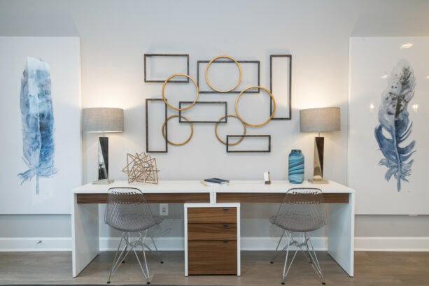
Another easy way to create an accent wall in an office is by using wall art.
This is the best option if you want to keep the entire home office walls simple and minimalist in a neutral color. Yes, even on a neutral-colored wall, you can still create a statement and an accent. All you need is massive wall art.
This wall art is 60” Bronze Gold Metal Abstract Wall Art, Geometric Shapes Open from Uttermost. When it comes to dimension, it’s obvious that this is huge wall art. It’s recommended to hang it right over your desk.
The designer placed two lamps on both sides of this wall art to bracket it to achieve a balanced look.
There are also other huge wall arts on both sides of the lamps, a blue feather in a white canvas.
Unfortunately, there’s no information about this wall art, but if you like feather art like this, as an alternative, you can go for “Waterfeathers II” Digital Paper Print by Pela Studios, 14” x 32”.
We can see that basically, the wall on this side is painted simply white. But it makes a great accent wall just because the designer managed to use wall art and artworks as a part of the decoration.
11. Floor to Ceiling Monochrome Framed Artworks as an Office Accent Wall
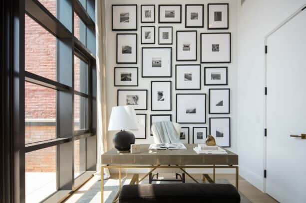
If you have a small home office, it’s best to avoid any bold and dark accent walls. Those can make your office look crammed and smaller.
Indeed, the best color for a small room is white because white can make the room bigger than it actually is, and create a bright and airy space.
However, using too many whites is also counterproductive. It will only make your office look too stark and intimidating, and reminds you of a hospital.
That’s why the designer incorporated a small amount of black in this all-white small office to counteract the starkness of white.
Look how the designer hung a series of framed artworks from floor to ceiling to create an accent wall.
It’s practically not floor to ceiling because these framed artworks stop just a few inches above the floor. But some were hung very low in the wall, filling almost the entire surface.
This is your best bet if you want to create an accent wall in a small office. The monochrome artworks will help open up the small area but at the same time accentuate it too.
Tip: for a small office, if you use a series of framed monochrome artworks like this, make sure you hang them orderly, in a clean and straight line. Avoid a freeform design because it creates clutter, and clutter will only make a small room even smaller.
12. Creating an Office Accent Wall out of a Built-in Floor to Ceiling Bookcase
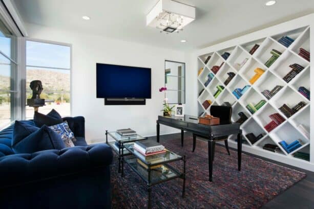
For practical use, you can install a built-in floor to ceiling bookcase to accentuate the room. This can be the most functional accent wall.
If you prefer to stick with neutral color, the only options left for you to create an accent wall are using textured materials or creating a functional area. The homeowners picked the latter.
Every single thing in this home office looks structured and well-organized.
See how the bookcase was designed in a diamond-shaped instead of a usual horizontal rack. Maybe because the homeowners think that the usual bookcase can create clutter and won’t look aesthetically pleasing too.
So, to create a unique look, the designer custom built this bookcase, filling the entire space of the wall.
The bookcase itself is painted in white. It means that even though it is unique and all, the neutral color makes it a very plain accent wall. That’s when the homeowners cleverly used their book collections as decoration.
The books were organized based on colors in this bookcase. It creates a color gradation that contrasts the white bookcase, a visually aesthetic design for those who crave an organized look.
13. Peel and Stick Wall Mural as a Vibrant Office Accent Wall
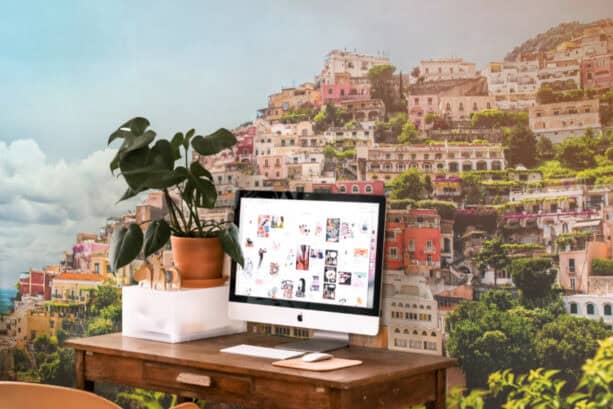
If you’re a renter, it would be quite difficult to do something to the wall. But that doesn’t mean that you can’t create an accent wall in your home office. There’s always a solution for every problem.
You can always rely on peel and stick removable wallpaper for a less permanent option. Unlike the usual wallpapers, this one is easy to install and easy to remove. No commitment is needed.
This home office features one. This hyperrealistic wall mural is basically a removable wallpaper, a peel and stick product from Eazywallz.
So far, this is the simplest and easiest way to create an accent wall. You can install it on your own in a blink of an eye.
There are many options for removable wall murals that you can choose. All you have to do is pick the right one to fit the style of the office. Avoid a wall mural with bigger patterns for a small office because they will overwhelm the room.
If you want to make the wall mural stand out, make sure you choose the basic furniture. Like in this office, the simple wooden desk won’t steal the attention of the impressive wall mural.
14. Gray Painted an Accent Wall in a White Office
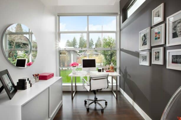
This is another small and narrow home office.
Like any small room, this one also features a huge window that takes up the most space in the wall. Yet, that’s not the accent wall. The designer picked one of the two side walls in this room to turn into an accent wall.
Using dark gray as an accent wall is quite a revolutionary wall in a home design because the dark shade can make the room appear smaller. Yet, the designer cleverly managed it.
They added other elements to make the room look more spacious, say, the huge windows, mirror, and white walls, ceiling, and furniture. FYI, the walls are painted in Benjamin Moore – Decorators White.
The accent wall is painted in Benjamin Moore – Kendall Charcoal. It’s so dark that it looks black.
To counteract the darkness in this room, the designer hung white framed pictures on the wall. Plus, on top of it, there’s a long window to let more natural light enter the room. What a perfectly balanced room!
15. Dark Blue Accent Wall with a Fireplace Surrounded by a Porcelain Tile in a Home Office
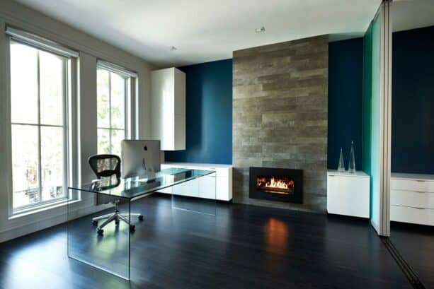
Simple and stylish are two key elements to create a contemporary look.
The accent wall is painted in blue; the look stands out against the white walls in the entire office.
According to the designer, the blue paint here is from Home Depot, but there’s no certain information about the name of the paint. Maybe it will help if you ask for a sample of dark blue paint from Home Depot.
To create another contrast, the designer also placed white storage in front of the walls; two are base cabinets floating on the blue wall, while one is an upper cabinet installed on the white wall next to this accent spot.
Right in the center part of this accent wall, there’s a fireplace surrounded by a porcelain tile. The porcelain tile here has three different sizes, and the designer combined them together to create a more whimsical look.
See how rich the designer made this room. They didn’t stop at painting the accent wall in a bold color. They also added a raised porcelain tiled fireplace to add more textures and white storage to create more contrast.
What a thoughtful way to create an accent wall in a simple and minimalist home office.
16. Half Mount Fish Replica in a Soft Green Office Accent Wall
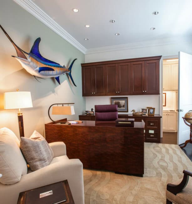
If you think that bold colors aren’t for you and wallpaper is not your taste either, you can consider using wall art. Unlike the wall arts that you’ve seen before, this one is so majestic.
This home office is basically traditional, so it’s normal if the homeowners want to avoid any bold and vibrant color. Yet, a fish replica on the wall is the best alternative to create an accent wall.
It looks a lot like 58” White Marlin Half Mount Fish Replica from Mount This Fish Company. It adds more dimension to the wall, accentuating the whole surface. No need to add many wall arts if you can create a three-dimensional look with this one.
The wall itself is actually painted in a different color from the other walls in the room, so basically, it has all it takes to become an accent wall.
Yet, since the color is muted, it will be great if any wall art is added. It is a very soft green color that blends seamlessly with its surrounding.
That’s why most people can hardly see any difference here. The designer wants to create as subtle contrast as possible, not attract too much attention.
That’s the best advice you can follow. If you want to incorporate three-dimension majestic wall art like this, make sure the canvas, which is the wall where it is hung, doesn’t demand too much attention.
Choose one attractive item at a time, the wall or the decoration.
17. Built-in Wood Cabinets as an Office Accent Wall
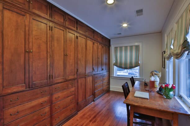
Another traditional home office on the list.
Like most traditional designs, wood is incorporated. But in this office, the wood is the dominant element. See how the wood floor and the wooden desk complement each other.
To top it off, the designer also created an accent wall out of medium tone wood that matches the floor, so it looks as if the floor and the accent wall blend seamlessly.
The wooden accent wall, FYI, is not just a wall. It’s basically built-in cabinets that take the entire space of the wall. What a genius way to save more space in a small room.
This is also a recommended look if you want to avoid clutter in the room.
Actually, there are many ways to create a functional accent wall. You have seen a built-in bookcase and a window wall as an accent in a home office, but this one is practically new and innovative.
If you can build cabinetry right on your wall, why settle for the ordinary accent walls?
As a decoration, this wooden accent wall can add a touch of vintage and elegant look to the room, delivering a warm and inviting ambiance.
18. Combination of Bricks and Wall Covering as an Accent in a Small Office
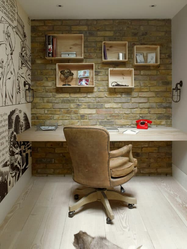
Actually, it’s a bit hard to make sure which one is the accent wall in this home office. It seems that the homeowners intended to add a fun element to the room, so one accent wall wasn’t enough.
Right in front of the desk, is the accent wall made of bricks. It’s clear that the bricks have been stained to achieve this soft green shade, a perfect way to add a freshening ambiance. Plus, it’s also meant to be a background for the other accent wall.
Right in the brick accent wall, there are hanging racks to store office supplies.
These racks look like a niche in the wall, with a recessed design, creating a kind of nook. It means that the items stored there are visible. This way, it’s important to make sure that everything in those racks should be well-organized. It would be even better if there were some decorations there.
To add more fun, the homeowners installed a wall covering on the sidewall, right on the left of the desk.
The black and white wall covering may feature neutral colors, but they have successfully made a statement.
Combined with the brick wall, the beige floor, beige wall, and light tone wooden desk, this wall covering looks more prominent and accentuating.
So, the advice here, if you want to incorporate two accent walls in an office, make sure the other looks less outstanding.
19. Do’s and Don’ts in Choosing Office Accent Walls
It may seem easy to get anything to create an office accent wall. It’s true that the ideas are endless. But, be careful when choosing the color, material, and surface for the wall.
Here are some do and don’ts that you should consider:
- DO: Think beyond solid colors. It’s important to think out of the box when you’re choosing an office accent wall. Don’t settle with a simple wall paint if you can use many ways to paint it. Your office accent wall may be perfect for polka dots, stripes, or a specialty paint finish. Consider using metallic to create a powerful style statement.
- DON’T: Forget about texture. You can also create a different texture in your office accent wall. Include a gallery of artworks or photos, hang a fabric-draped wall, or install extensive shelving to create an office accent wall. Remember, the only rule for office accent walls is that they should accent a wall, as simple as that.
- DO: Use an accent wall in a neutral room. Actually, accent walls can work as well in a bright office as a neutral one. The initial idea of an accent wall delivers visions of bright blue or red, but in a neutral color palette, a dark brown wall will give a similarly dramatic effect.
- DON’T: Shy away from bold colors. There’s no strict rule about the color of an office accent wall. As long as you match the color of it with the other elements and decorations spreading out in the office, you can choose any color that makes you happy.
- DO: Consider the color of the other walls. Consider the color on your other walls. Commonly, accent walls look best when they are side by side with light to medium shade walls. In an all-white office, an accent wall will look appealing but tricky. The contrast of it can create a modern look, but it may look too stark. Keep in mind the balance of the strong accent wall with neutral wall colors in the rest of the office. In a white office, soften the contrast with a mid-tone accent color.
- DON’T: Forget about wallpaper. If you want a simple yet striking accent, you can just use wallpaper. Easy peasy. There’s also a peel-and-stick temporary wallpaper that can deliver a designer look without a long-term commitment. Opt for wallpaper with beautiful designs and colors to create a chic style. This is the best option for renters.
Leave a Reply