Most people seem to forget this fact, but the exterior trim color is as important as the siding color. It delivers a decorative detail to the facade.
Trim doesn’t only work on the window and the door but on the roof and the siding accent. It shows that trim plays a big part in an exterior color palette.
When it comes to white houses, actually, you can pretty much combine it with anything. White is a versatile color, which means you can be free to experiment with it.
The thing is, in terms of exterior, most people tend to be careful when choosing the trim so it won’t look too bold and too flashy.
Remember that trim can give an unexpected splash of color. You can make it blend with the whole siding by complementing it or make your front door and window stand out.
The key is you have to find the paint that fits your personality and your home’s style.
So, how to find the right exterior trim for a white house?
It’s not as easy as you thought; below, we’ve curated the most appealing trim colors for white houses that won’t make your home look too typical and cheap:
1. Turquoise
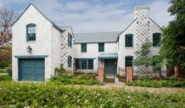
Actually, it may be a bit out of place to add a bright accent color to a traditional exterior.
The traditional setting usually requires only natural or neutral tones. However, the designer seemed to break all the rules here.
They painted the trim of this classic white house in a turquoise color. You can’t only see it on the windows but also on the front door, the garage doors, and the cover above those doors.
The house is constructed with white bricks accentuated with stone in the front.
Despite the turquoise trim, the classic elements in this house managed to give a traditional appearance. They are meant to tone down the brightness of the turquoise.
Look how the trim seems a bit pale and earthy against the white bricks and the accent stone.
To steal this look, make sure you pair the bold trim with many brick surroundings, white color, and stone to counteract the bright trim’s modern and contemporary vibe.
It won’t hurt if you have some traditional architectural details, like gable roofs, chimneys, brick columns, and metal fence and gate.
2. Charcoal
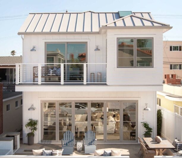
This house exterior is quite unusual because, in some parts, it has a good farmhouse style, while the other parts resemble a beach-style look.
The architectural details and how the homeowners decorated it with Adirondack furniture show a farmhouse design. Still, the color scheme is quite coastal, even though it lacks green and blue.
This house exterior proves that to achieve a coastal look, you don’t really need blue and/or green to be paired with white.
See that even with the charcoal gray trim, this exterior still delivers a beach style. It’s because the white walls around totally own the whole look. It screams louder than any detail added here.
Yet, that doesn’t mean that the trim is useless. In fact, contrasting the white walls with charcoal trim makes the entire exterior look softer. The charcoal gray tones down the brightness of white that might look too crisp for some.
This kind of house is suitable for the beach living area. You don’t need blue or green color to represent the beach because the beach is already reflected in the house.
3. Black
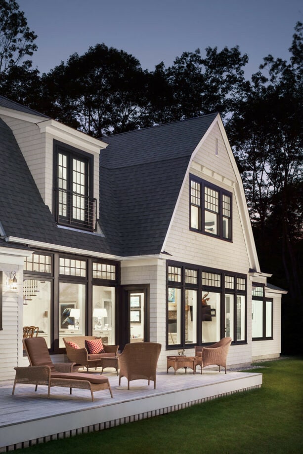
This is another beach-style exterior with a lack of blue and green color that’s usually associated with a coastal design.
Instead of blue/green and white, the designer preferred to paint the whole exterior in black and white, but somehow that doesn’t make it look traditional.
The white siding is actually a custom blend color, while there are two types of trims here.
The first one is the roof trim. It’s basically a basic white color. You can pick any bright white color in any paint manufacturer to mimic this. The second one is the window trim.
The window itself, all of them, are from Andersen in A-series black. The window trim is also a custom blend color to match the windows.
Black and white is a classic, timeless combo. Basically, you can incorporate this color scheme in most home design styles. The monochromatic look will make the house appear grande, luxurious, and elegant.
If you want to achieve a beach-style look with a black and white color combo, adding some nautical designs to your exterior is recommended.
4. Hunter Green

There’s something strange (in a positive way) about this house.
The architectural designs show this is a traditional house, but the color scheme is quite the opposite.
It’s rare to find any bold and vibrant color in a traditional setting because the traditional design is meant to blend with nature, not draw much attention.
However, this house has a hunter green trim that looks pop against the white siding. Better yet, the hunter green also frames the front door, which was painted in a bright red color.
The designer wanted to make a focal point through the front door, and they nailed it! Look how the hunter-green trim contrasts the bright red door.
But somehow, they complement each other because hunter green is a cool tone, while red is a warm tone. Together they create a perfect visual balance.
While for the siding, hunter green adds a more natural look. After all, no matter the shade, green is a natural color, one of the earthy tones. It’s your safest option if you don’t know what to pair your white siding with.
Tip: if you want to use hunter green trim on a white siding, it would be better if you have a front yard landscaping filled with greeneries. The green plant will blend seamlessly with the green trim.
5. Olive
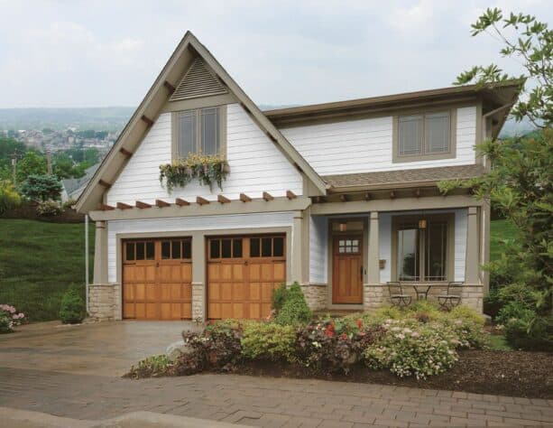
Olive is actually another shade of green, but this shade delivers a totally different look from the previous picture.
Hunter green is a cool tone, but olive on this exterior is warmer. This is a perfect shade for a craftsman’s exterior because it corresponds well with a medium-tone wood, a must-have element in a craftsman’s design.
The designer painted all the trim, including the roof trim, the windows’ and the doors’ in olive color to create consistency. Moreover, the columns supporting a pergola above the garage and front door are also painted in olive.
It’s clear that the designer wanted to minimize the color usage in this house’s exterior to avoid getting too bold.
Just like any craftsman’s design, don’t forget to add some medium-tone wood elements.
The designer carefully picked the doors, both for the garage and the entrance, that were made of medium-tone wood to enhance the arts and crafts style. See how they go very well with the olive trim.
6. White
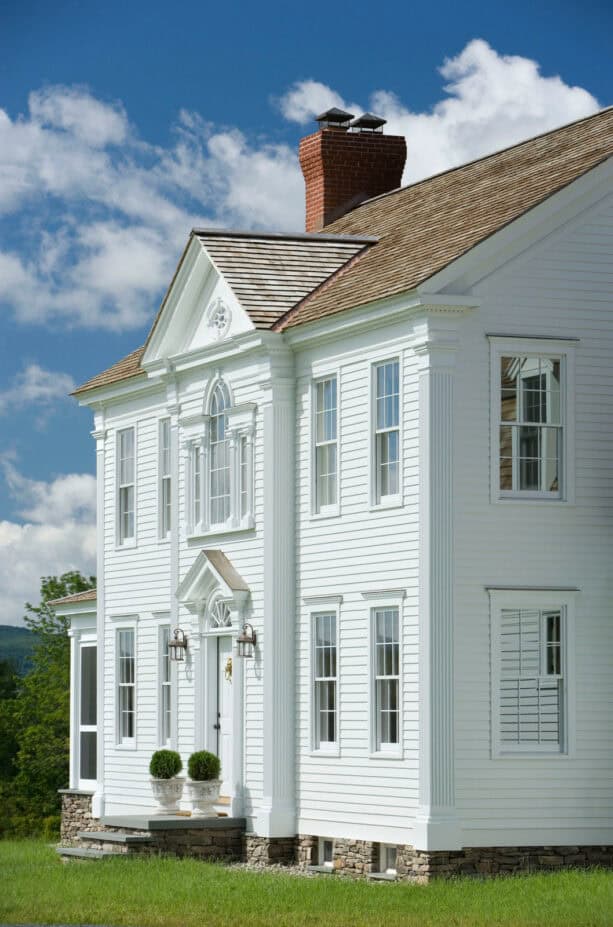
White is known as a color that can make everything in it appear larger, including the house.
If you paint your exterior entirely white, you’ll instantly make your house look bigger than it actually is.
To be honest, this all-white design is more suitable for a small house because it can double the size. But that doesn’t mean you can use the all-white design on a large house.
This two-story house is actually a large house, but that fact didn’t stop the designer from painting the siding in white and the trim in a similar color.
Both the siding and the trim of this house exterior were painted in Benjamin Moore – Brilliant White.
There’s almost no accent to contrast the white. The siding and trim go hand in hand to make this house look more elegant, sophisticated, and grand.
Despite its ability to create a large illusion, white is a timeless color that’s often associated with a traditional setting. Pair all-white design with any traditional architectural details, and you’ll get a classic, colossal house.
Even though the all-white exterior might look majestic and all, don’t forget to add some accents to counter the starkness. Even if you refuse to add additional color, adding a stone accent or colorful blossoms in the front yard won’t hurt.
After all, white is forever meant to be a canvas. It would go to waste if you didn’t add a splash of color.
7. Beige
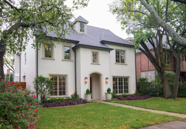
Even though the trim of this white house looks beige, according to the designer, it was not painted; it’s stonework.
How lovely is that?
The whole siding was painted in Sherwin Williams – White Duck, while the windows were in Sherwin Williams – Pavestone. The stonework around the windows was custom-made to match them.
The beige trim doesn’t only frame the windows but also the arched opening that leads to the front door. We can see that actually beige and white are a match made in heaven. Look how they complement each other.
This is the perfect option for a color trim if you want to achieve a traditional setting. It’s only a few shades darker than the white surrounding, so it gives a contrast, but only subtly and softly.
For some, beige on white surroundings might be a bit too pale. So if you want to use this color scheme, make sure you add some dark elements to add a different effect.
In this project, the house has a dark roof that sufficiently contrasts the white siding and the beige trim.
8. Light Tan
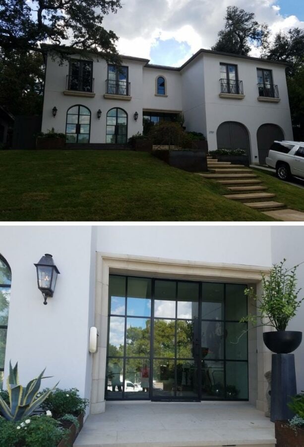
Similar to beige, light tan is a perfect option to complement the white siding. It’s darker than beige but still soft and light.
Even though it’s darker than beige, light tan is still considered a natural shade, one of the lovely earthy tones. Together with white, they deliver a monochromatic look that doesn’t look too plain.
The designer managed to combine the neutral colors in this exterior without breaking too much sweat.
The main exterior wall is painted in a bright white, while the trim is all painted in a light tan. However, the windows and the doors have a black metal frame. It makes the light tan trim work double; it contrasts and complements the color simultaneously.
Of course, light tan corresponds well with the white exterior; they complement each other. But juxtaposed with the deep and dramatic color like black, light tan trim will look pale. But that’s how it works. It’s supposed to bridge the black and white so the transition doesn’t look too abrupt.
A soft transition like this is what you need to create perfect tonal work.
9. Coral
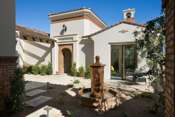
In any Mediterranean design, coral brick shade is what you need to enhance the style. It’s obvious that one of the must-have elements in a Mediterranean style is brick and its natural color. This exterior is quite unique in a beautiful way.
The exterior is stucco white, just like a typical Mediterranean house. The brick is added as an accent to the trim.
Instead of framing the window and the door, the brick trim accentuates the roof and creates an arched opening. Right above the main entrance, there’s also a brick decoration to match the trim.
The brick has a coral shade, a natural color of brick that’s more red than brown. The reddish coral looks pops against the white exterior wall, making the whole house appear warm and inviting.
If you want to lessen the dramatic effect of the contrast, opt for an off-white or creamy white color for the exterior wall instead of a bright and crisp white.
The reddish coral shade will be easier to blend with an off-white surrounding. Another way to counter the contrast is by providing a transitional shade.
For this exterior, the designer painted the window frame brown to complement both the coral and the white.
10. Soft Yellow
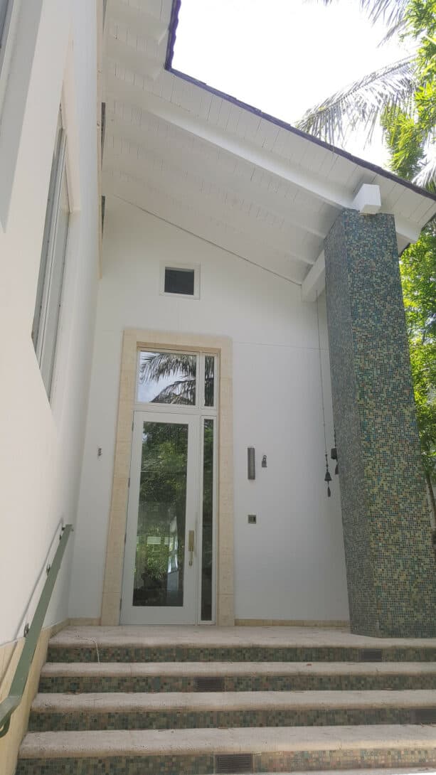
If you’re a big fan of yellow and want to incorporate it into your exterior, it would be better to restrain yourself from using a bright and sunny yellow paired with the white siding or wall exterior.
It’s because a vibrant shade of yellow will look too bright if you combine it with a bright white. Both of them will look so flashy that it hurts the eyes.
Instead, opt for a softer and paler shade of yellow. You can still make a statement through a soft, creamy, buttery yellow like this.
Compared to beige, soft and light yellow delivers more contrast to the white walls around. They might look interchangeable, but soft yellow trim like this can add more character to the white house because it’s not a neutral shade like beige.
Since yellow is a bold color, no matter the shades, it would look out of place in a traditional setting. Soft yellow works better in a more modern or contemporary environment like this.
You can add another accent, like tile or stone, in the column or the lower wall to softly contrast the soft yellow trim.
11. Light Gray
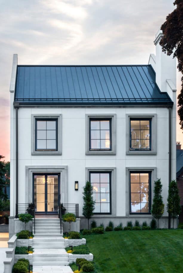
We can’t deny that black and white is a timeless and elegant color combo. However, for some, it might be too plain. That’s why adding another accent is preferable.
In this case, the designer added the gray trim to accentuate the black and white color scheme.
The color scheme makes this house look stylish and trendy. With the right combination, black, white, and gray will deliver a modern style because they represent minimalism and simplicity, a key element in a modern design.
The exterior is made of a white stucco that appears bright during the day. While the roof, the windows, and the door are painted in black to contrast the white.
The gray trim comes to the rescue to close the gap between black and white. Since this is also a neutral shade, it contrasts and complements both black and white.
The gray trim nicely frames the windows and the french door, but the gray also appears on the lower wall that’s meant to be the house’s base. It also bridges the white stairs and the black railing at the front of the house.
Remember, black, white, and gray, although they look trendy, might look too “dry”.
Pro tip: if you choose to use this color scheme for your exterior, don’t forget to build greenery landscaping to avoid the arid look.
Plant some trees and bushes that stand against the white walls and gray trim like this to add more natural touches.
Closing
The best exterior trim color basically depends on the overall appearance you want to achieve. Adding a pop of color doesn’t mean you have to opt for bold and vibrant trim color to contrast your white siding.
You can choose a monochromatic color by combining two neutral colors for your siding and the trim and still get the splash of color you need.
While in fact, a monochromatic exterior will deliver an elegant and subdued look. But on the other hand, a high-contrast color palette will give more interest and depth to your exterior.
Colors like green and turquoise will add extra depth and more character to your house. On the contrary, black trim on a white house will showcase the architectural features that create a modern and contemporary look.
It’s also possible for you to create contrast even without a flashy color. You just have to choose a trim color that’s a few shades darker than your white siding.
For instance, beige or off-white will totally work well on a bright and crisp white siding. You must just pair shades from the same color to emphasize your exterior architectural details without making them too prominent.
The best complementary trim for an off-white house is taupe or light tan. This tonal appearance will look good, especially on a traditional or classic style house, where a bold pop of color might look odd.
If you still don’t know what shade to pick, always rely on earth tones for the trim to complete your white house. It can make your house blend more easily with the natural surrounding.
Leave a Reply